
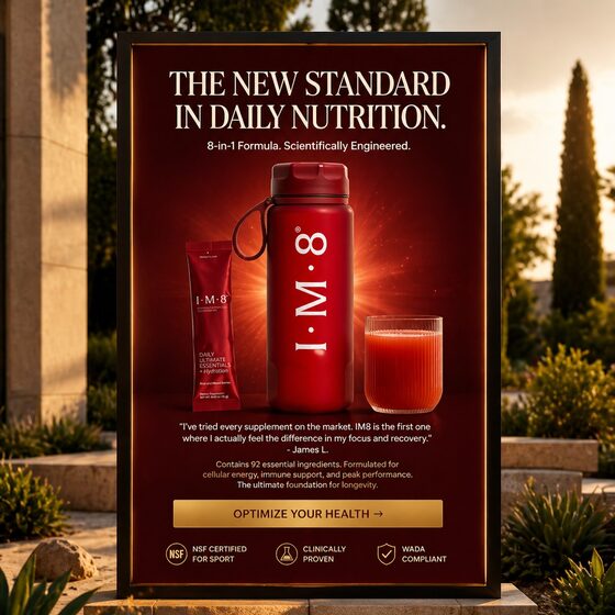
Most people look at a finished ad and see a design. Operators see a stack of decisions. Here is a claim-led static from the IM8 sample library, annotated decision by decision — not why it performed (that depends on the account), but why each element exists and what job it does.
 123456
- Category claim, not product claim. "The new standard in daily nutrition" positions against the whole category. Serif type borrows editorial authority — it reads like a magazine verdict, not an ad.
- The mechanism line. "8-in-1 formula. Scientifically engineered." One line converts a big promise into a concrete reason to believe. Every strong claim needs its mechanism within one eye-jump.
- The product block owns the frame. Bottle, sachet, and glass form one unmistakable brand-colored mass in the center. At feed size, this reads as a single red monolith — recognizable at thumbnail scale.
- Proof interrupts the pitch. A customer voice sits between product and CTA — right where skepticism peaks. The quote is specific ("focus and recovery"), not generic praise.
- The CTA sells the outcome, not the click. "Optimize your health" continues the argument. Gold-on-red makes it the only warm-metal element in the frame — the eye lands there last, on purpose.
- Compliance as a closer. NSF / clinically proven / WADA badges end the read. In a skeptical category, the last thing scanned should be third-party trust, not another adjective.
What to steal
The structure travels to any considered purchase: category claim → mechanism → unmistakable product → specific proof → outcome CTA → third-party trust. Twenty ads later, you'll know which layer your market actually argues with — and that's the layer to iterate.